Thursday, October 28, 2010

"Fruit and Silver"


"Fruit and Silver" - Oil - 6" x 8"

"Our crop of mission figs was down a bit this year, but I had enough to paint, if not enough to fill my yen for them." --- SFG

NOTE TO ARTISTS: This was done simply and fast. The smaller the painting, the better simple shapes work.

Tuesday, October 19, 2010

"Heavenly Happiness"


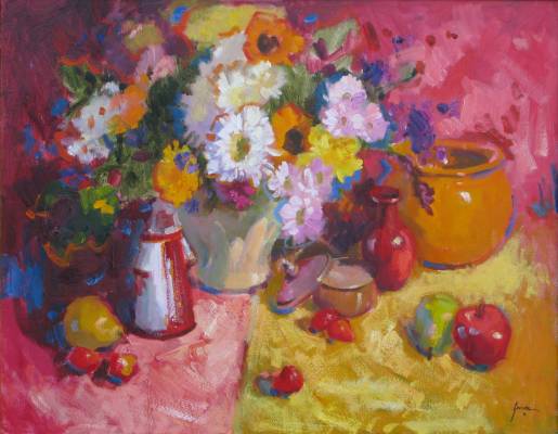
"Heavenly Happiness" - Oil - 24" x 24"

"'Heavenly Happiness' is a reference to the perfect happiness and inner peace promised to be enjoyed by the soul in heaven. Portions of this painting approached that state for me, since the process is as much spiritual as it is the use of practical skill. Many, many of the artists I've encountered over the years have confirmed this experience and conviction." -- SFG

NOTE TO ARTISTS:

I'm set up and ready to go. I have the still life set near the window of my studio for indirect, cool light. My canvas is lit by the overhead lights behind me (and not in shadow...something I'm always reminding my students to check).

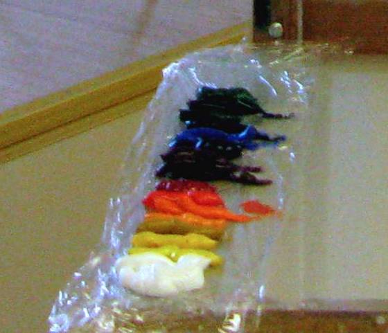
I've laid out a full palette.For many years I had to chip dried paint off my palette where it had dried in piles because I procrastinated and didn't clean it after painting. Now, I put a layer of plastic wrap under the colors and use the other half of the wrap I've allowed to dangle over the edge to cover the paint between painting sessions. The paint stays workable for two or three days if my studio is cool.


To draw in the subject, I first marked the top of the flowers and the bottom of the pitcher since they overlapped and formed the main vertical unit of the piece. I paid attention to the spacing between objects and the division of the entire space. I made sure the edges of the window did not hit the middle of the left side or the middle of the top.


Apologies for the inconsistency in color. On a tripod, the top of the camera was above my eye level and a dial had been turned inadvertently. Wish I was an expert with a photo-editing program.

As you will see, I did not try to reproduce the colors. My purpose was to paint the RELATIONSHIPS between the colors. This must ALWAYS be done. Without doing so, it just won't work. The colors will not ring true and, more than likely, will be muddy and cold.

At this stage, I decided to paint the vase holding the flowers black so it makes a vertical dark mass with the dark parts of the arrangement. My wash for the drape is warm (remember, cool light yields warm shadows). I've used thin washes, slightly exaggerating the variety of colors I see in the pitcher and the bottles. Also, I've described the differences in temperature of the small flowers.

Look at that! An apple has magically appeared to the right of the blue bottle. It was needed for compositional purposes and nicely repeats the shape of the lower part of the pitcher. I've painted hundreds of apples over 35 years, so I should be able to fake it now and then. ;)

I've also used a very warm and clearly darkened background to contrast with the cool lights on the table top and in the bottles and flowers. As I review these photos, I like this composition with a light area on the right and could have preserved it, but I didn't notice its advantages at the time. It's not a mistake, just another alternative and you work with what you have in all stages of painting. The end product is the result of alternatives chosen along the way.

At this stage, I'm becoming more specific about the various purples of the smaller flowers and have thrown similar hues into the background. I've worked on the apple and the blue vase that has a good deal of light coming through it. Through the window, though the light coming in is cool, the sunlit grass and foliage is quite yellow-orange. I'm beginning to put in the stems of the tiny red blooms with care since their linear quality contributes important directional elements.

Next came more specific notes of color for the green glass and the blue pitcher. When painting glass, I start with the overall color, especially that coming from the farthest side. If you look at the pitcher carefully, you'll see how I've used subtlely different colors to show plane changes that give volume to an object.

You'll notice that I started putting in the stripes of the fabric. Admittedly, I'm a little tentative about it and it shows. I don't want the stripes to take over the painting and I still want a loose effect that flows. I've noticed that faded fabrics have softer colors and are easier to "fit" into a painting. This one is very bright, so I'm not getting the effect I want.

I called it quits for the day. I'm painting more slowly than usual for some reason.


I've worked on the flowers more. Successfully, except for the rose, I think. Still dithering about the fabric, though. As I place each stroke, I look to see how it effects the rest of the painting. At least the apple looks good. The highlights on the pitcher were done sooner than I usually do them, but I didn't want the daylight to change before I did them. They were a lot of fun.

This is my stopping point for now. The flowers are right, especially after I repainted the rose. It was one of the most important elements and, as it was, repeated the circle of the apple too much. Now, it sings.

To judge the other parts, I will keep the painting out in the studio where I will see it as I pass each day. The way the mind works, just a glance will eventually reveal what should be changed. Always, it's best to let your eye cool off in order to see the work with a fresh eye.

Thursday, October 14, 2010

Work in Progress... "Variation on a Theme #4"


"Variation on a Theme #4" - Oil - 24" x 30"

"Continuing this series of rose paintings, I added fresh blooms and more vases. All these set-ups were lit by soft, cool light from my studio window. As you can see, my enthusiasm has not waned." --- SFG

WORK IN PROGRESS:


After painting the first three paintings in this series based on the larger arrangement of roses shown here, I rotated the vase a little and added fresh blooms and more clear glass vases. The pink rose at the lower left of the big arrangement was already drooping a bit, but its color was needed. For compositional purposes, I elected to make the meeting of the blue drape and the wall a horizontal line.


I marked the locations of each vase by marking the top and bottom of the largest arrangement and comparing the location of the other vases to that. I used the "saran wrap" method to indicate the overall shape of the large bunch of roses.


I added a bit more detail to the drawing placing the individual blooms. Notice the dots in the middle of some. Marking the center of the bloom helps me understand from what perspective I'm viewing it. For instance, a dot in the middle means I'm looking at it head on. If it is low and to the left within the circle, the rose is facing up and to the right.


For this painting, I wanted to get the distinct, though sometimes subtle, color differences between the blooms. I massed in the dark green leaves first, since they were the darkest value of the painting and I could compare the various values of the roses to that as I worked through the roses' temperature variations. I started with the coolest and worked up to the warmest. I did all the pink roses and the red one, and, finally, the orange to yellow ones.


My palette is pretty full as I finish this stage, but you can see how I mixed colors next to one another to determine the temperature relationships and value differences between them.


Before I did any detail on the flowers and vases, I made sure that the background and table surface related properly. It would be easy to ruin all the colors I'd worked on by putting the wrong temperature or value behind them.


Finally, I can put the icing on the cake with rhythmic calligraphy on the roses and the sparkle on the vases.

Monday, October 11, 2010

"Variation on a Theme 6"


"Variation on a Theme 6" - Oil - 8" x 6"

"The last in this series of rose paintings is a closeup of two of the roses. Using a small canvas, I laid on the paint with vigor, thick and decisive. The energy of these small works set them apart and speak for themselves." --- SFG

Sunday, October 10, 2010

"Variation on a Theme #5"


"Variation on a Theme #5" - Oil - 11" x 14"

"I selected the round vase from the previous setup and gave it a classic light-against-dark treatment. The value contrast makes a strong painting and the round vase, a pleasant contrast to the complex blooms." --- SFG

More info

Thursday, October 07, 2010

"Variation on a Theme #4"


"Variation on a Theme #4" - Oil - 24" x 30"

"Continuing this series of rose paintings, I added fresh blooms and more vases. All these set-ups were lit by soft, cool light from my studio window. As you can see, my enthusiasm has not waned." --- SFG

More info

NOTE TO ARTISTS: I will be adding a work-in-progress discussion of this painting in a few days.

Wednesday, October 06, 2010

"Variation on a Theme #3"


"Variation on a Theme #3" - Oil - 8" x 6"

"My third painting (see previous posts) was a small 8" x 6" version. I laid the paint on thickly and concentrated on lively, abstract forms." --- SFG

Monday, October 04, 2010

"Variation on a Theme #2"


"Variation on a Theme #2" - Oil - 11" x 14"

"For this second painting in the series, I chose a smaller canvas, 11" x 14", and used a more abstract close-up composition. The hues within the roses always stimulate my passion for color." --- SFG

Sunday, October 03, 2010

"Variations on a Theme"


"Variations on a Theme" - Oil - 20" x 16"

"This is the first of a series of six paintings. My roses are at their peak as the weather begins to cool in October. I start with one bouquet and paint three variations in three different sizes. Then, I added more to the setup and painted three more. I'll be posting them over the next few days." --- SFG

Wednesday, September 29, 2010

"April in Archer"


"April in Archer" - Oil - 8" x 10"

"Spring azaleas were spotlighted by morning sun in the little town of Archer, Florida, outside of Gainesville. As often happens, locals stopped by and filled me in on the history of the place. It was once the residence of the owners of the local ironworks located across the street. Still in business after over 100 years, it still prospers. With personable managers who are enthusiastic about what they are doing, it's no wonder." --- SFG

Tuesday, September 28, 2010

"Shed at Carter Cabin"


"Shed at Carter Cabin" - Oil - 8" x 10"

"These quick little paintings are such a joy to do. Catching the quality of light and shadow is the goal and the subject matter is the icing on the cake. This small building is located on the only privately owned property within a wilderness area in the United States. The owners graciously invite my family from time to time. It is certainly one of the most beautiful areas in California." --- SFG

Monday, September 27, 2010

"Backyard Jumble, McCloud, California"


"Backyard Jumble, McCloud, California" - Oil - 24" x 24"

"This rickety shed is set among the litter so typical of the charmingly trashy-chic community of McCloud, California. The small-town atmosphere and spectacular views of Mt. Shasta nullify any need for conformity to standards applied elsewhere. Once a rough-and-ready lumber town, it is now a get-away community for those from the Bay area or southern California. Artists who visit are grateful that it maintains this character for it is infinitely more interesting than planned and rigidly supervised resorts." --- SFG

Sunday, September 26, 2010

"Beneath the Palms"


"Beneath the Palms" - Oil - 11" x 14"

"Artists find subjects wherever they are. This was painted on the front porch of our daughter's business Equigen in Archer, Florida. The landscaping near the building featured this handsome Sego Palm that grows so beautifully in the area. The glare of the sunlight behind the palm was actually the subject of the painting." --- SFG

NOTE TO ARTISTS:

Look beyond the obvious. Sometimes the negative areas say more than the positive ones.

Saturday, September 25, 2010

"Water Garden at Kanapaha"


"Water Garden at Kanapaha" - Oil - 11" x 14"

"Kanapaha Gardens in Gainesville, Florida is rewarding to locals and visitors alike, even on an overcast day as this one was. Its lush plantings near the stream on the west end of the gardens offered pattern and color." --- SFG

NOTE TO ARTISTS:

This is a "pattern" composition. Though you can find a focal point in the white flowers against the shadowed water and stone, they are not strong enough to carry the load. Sometimes, when you don't see a very dominant point of interest in your subject, the painting will still be successful if you emphasize patterns and texture throughout it.

Tuesday, August 24, 2010

"Open Gate"


"Open Gate" - Oil - 8" x 10"

"My plein air paintings are a diary of my life. A few weeks ago, when we were visiting our son and daughter-in-law, the guys wanted to attend an RC model competition. Having experienced two generations of contests, I went down the road and set up my easel in this picturesque rural setting. I did two small paintings while my husband and son enjoyed the event. I enjoyed myself as much as they did!" --- SFG

"Springtime in the Vineyard"


"Springtime in the Vineyard" - Oil - 11" x 14"

"This vineyard, perched on the hills above Cambria, California, defied the image of a slick winery and had rustic appeal of its own. The old barn harkened back to the days when it was a cattle ranch." --- SFG

NOTE TO ARTISTS:

Yesterday, I started to write this blog, first showing the work as it was when I stopped work on it in the field. Then I had another shot of the "finished" work. When I had both images on the screen, I realized that the painting was better in the "before" view than in the "after".

Before:


After:

I had lost the simple shadows on the barn and overdone the lines around the barn doors. Today, I reworked it and am happier with the result. Sometimes we loose sight of the big things when we begin to "noodle"!

Sunday, August 22, 2010

"Nursery Near Hubbard"


"Nursery Near Hubbard" - Oil - 8" x 10"

"The area south of Portland, Oregon, is where much of the landscaping plants for the west coast are raised. The beautiful patterns such nurseries make as they drape the hillsides and fine landscape painting material. This one is in view of Lenhart Air Park." -- SFG


Saturday, August 21, 2010

"Near the Shed"


"Near the Shed" - Oil - 8" x 10"

"While visiting our son and daughter-in-law, I painted the farms within walking distance. This one, across the road, had sheds, a small vineyard, and roses at the end of the driveway. The light was just right to enjoy the blooms." --- SFG

More info

NOTE TO ARTISTS:

These small paintings that I've been posting lately are not masterpieces, but are part of the ongoing discipline of painting. Many are done while traveling with family or friends.

An artist must maintain his skills. Bill Reese, a wonderful teacher, said (often), "If you paint every day, you get better. If you paint every-other-day, you stay the same. And if you paint every third day, you get worse."

Friday, August 20, 2010

"Ann's Table"


"Ann's Table" - Oil - 16" x 20"

"Fellow artist Anne Laddon sets a lively table when she entertains. With the other Alla Prima International artists, we shared a fun and inspiring time at her beautiful home near Paso Robles, California. Here's a corner of that table, complete with wine, dip, and vegies." -- SFG


Thursday, August 19, 2010

"Tree in Kanapaha Park"


"Tree in Kanapaha Park" - Oil - 8" x 10"

"This was just a quick morning sketch on location, but it describes the tree and park setting nicely." --- SFG

Friday, August 13, 2010

"Near Stanford's Museum"


"Near Stanford's Museum" - Oil - 11" x 14"

"I set up my easel beside the Cantor Arts Center on the busy Stanford University campus. Despite the foot traffic, it was a pleasant and inspiring setting. The shapes of the trees were a good foil for the cars and pedestrians." -- SFG


Thursday, August 12, 2010

"Til the Cows Come Home"


"Til the Cows Come Home" - Oil - 11" x 14"

"This farm and field in Archer, Florida, was brilliantly lit in the spring light. Cattle ambled through the scene and I added them when they arrived at the best spots for the composition." -- SFG


Wednesday, August 11, 2010

"The Yellow Barn"


"The Yellow Barn" - Oil - 8" x 10"

"I love to paint the farms of Oregon. This one, outside Molalla, was a historic treasure, I'm sure." -- SFG

Monday, August 09, 2010

"Burney Falls 2"


"Burney Falls 2" - Oil - 14" x 11"

"Here is another view of Burney Falls in northern California. Situated in a California State Park, the cascade strikes outcrops near the top that redirect the flow. Then the froth free-falls to the misty pool far below.." --- SFG

Sunday, August 08, 2010

"Flowers and Russian Doll"


"Flowers and Russian Doll" - Oil - 24" x 30" - Private collection

"I painted this about ten years ago and it has been in a private collection since, but I've finally arranged for reproductions of this work to be available. As you can see from the enthusiastic use of color and loaded brush work, an alternative title could have been 'Fit of Joy'! Click on the title to get information about prints and note cards." --- SFG

Wednesday, July 28, 2010

"Lilacs and Twilight" -- revisited


"Lilacs and Twilight" - Oil - 11" x 14"

"I'm always attracted to a tranquil scene and this fit the bill perfectly. All was in cool shadow and backlit by the evening sky. The rough condition of the barn synced with the profusion of lilac shrubs left untended. Their chaotic condition added just enough action and texture to draw the eye." --- SFG

NOTE TO ARTISTS: I remember a comment by Bill Reese years ago to a suggestion that a just-completed painting was ready to go on a gallery wall. He said, "I like them to hang around the studio for a while." I took that to mean that it takes a while for the artist to see the work with a fresh, unprejudiced eye in order to see the painting's strong and weak points.

If you look back to my blog on October 9, 2009, you'll see this work in progress. Still, over time, something just didn't look right to me, like the color of the roof and the way the driveway was such a strong diagonal that it led the eye up too fast. Today, I put the painting back on the easel and made some changes.

The before and after:


Adding the reflections from the part of the sky that would be behind me adjusted the color of the roof and related it better to the areas no longer lit by the sun. By adding the bush in the lower right, the shape of the driveway was changed considerably and negated the harsh diagonal movement.

Tuesday, July 27, 2010

"A Walk in January"


"A Walk in January" - Oil - 11" x 14"

"This unusually warm day took me to a nearby neighborhood. Though it was sunny, the light was still cooler than that on a summer day. The light and the almost-bare trees testify to the season." --- SFG


NOTE TO ARTISTS: Here is another work that was painted primarily on location, but finalized in the studio. Here are the before and after for you to compare.


The contrast in the unfinished work was a bit too wimpy, though, to stay true to the scene I kept it within bounds. By punching up the white trim on the center house, the architecture is more solid. I added shapes to the plantings to break up the blank walls and reduced the background house on the right to closer values, so focus would remain on the center of interest. I added the mail box on the right to stop the eye and return it to the painting. Otherwise, the sweep of the sidewalk accelerated the movement and swept the viewer off the canvas.