Showing posts with label flowers. Show all posts

Thursday, April 19, 2012

"Purpose"


"Purpose"  Oil  12" x 12"

"I am not sure why I titled this subject "Purpose" unless I was thinking of the joy such cheerful blooms give like a precious offering, however brief their span.

Delicious strokes portray the two open flowers as well as the bud and separate petal that lies to the right. The dark background enriches the vivid red and the warm tabletop completes a primary color scheme.

This is the third of my recent series of simple floral paintings, made special by lush paint application and rich contrast and color. As a group, these 12" x 12" paintings have a great deal of impact."
                                                                                                                                      --- SFG

Wednesday, April 18, 2012

"Opulence"


"Opulence" - Oil - 12" x 12"

"How I love rich paint and flowers! The two combine well in this new work, I think, and I‘ve titled it “Opulence“.

The heavy red blossoms support a brilliantly lit orange one that shows behind the first rank. Scattered leaves and blue accents move the eye through the space as a triangle of the crisp white drape defines the foreground tabletop.

The combination of thick impasto and winning color carry my enthusiasm to the viewer.

Prints are available at http://fineartamerica.com/featured/opulence-susan-f-greaves.html.

Tuesday, October 19, 2010

"Heavenly Happiness"


"Heavenly Happiness" - Oil - 24" x 24"

"'Heavenly Happiness' is a reference to the perfect happiness and inner peace promised to be enjoyed by the soul in heaven. Portions of this painting approached that state for me, since the process is as much spiritual as it is the use of practical skill. Many, many of the artists I've encountered over the years have confirmed this experience and conviction." -- SFG

NOTE TO ARTISTS:

I'm set up and ready to go. I have the still life set near the window of my studio for indirect, cool light. My canvas is lit by the overhead lights behind me (and not in shadow...something I'm always reminding my students to check).

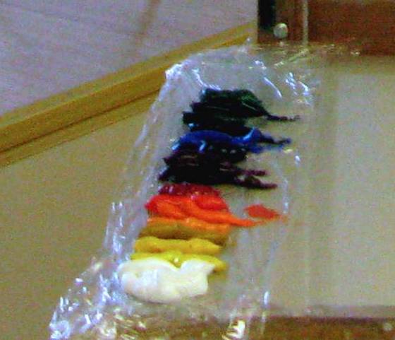
I've laid out a full palette.For many years I had to chip dried paint off my palette where it had dried in piles because I procrastinated and didn't clean it after painting. Now, I put a layer of plastic wrap under the colors and use the other half of the wrap I've allowed to dangle over the edge to cover the paint between painting sessions. The paint stays workable for two or three days if my studio is cool.


To draw in the subject, I first marked the top of the flowers and the bottom of the pitcher since they overlapped and formed the main vertical unit of the piece. I paid attention to the spacing between objects and the division of the entire space. I made sure the edges of the window did not hit the middle of the left side or the middle of the top.


Apologies for the inconsistency in color. On a tripod, the top of the camera was above my eye level and a dial had been turned inadvertently. Wish I was an expert with a photo-editing program.

As you will see, I did not try to reproduce the colors. My purpose was to paint the RELATIONSHIPS between the colors. This must ALWAYS be done. Without doing so, it just won't work. The colors will not ring true and, more than likely, will be muddy and cold.

At this stage, I decided to paint the vase holding the flowers black so it makes a vertical dark mass with the dark parts of the arrangement. My wash for the drape is warm (remember, cool light yields warm shadows). I've used thin washes, slightly exaggerating the variety of colors I see in the pitcher and the bottles. Also, I've described the differences in temperature of the small flowers.

Look at that! An apple has magically appeared to the right of the blue bottle. It was needed for compositional purposes and nicely repeats the shape of the lower part of the pitcher. I've painted hundreds of apples over 35 years, so I should be able to fake it now and then. ;)

I've also used a very warm and clearly darkened background to contrast with the cool lights on the table top and in the bottles and flowers. As I review these photos, I like this composition with a light area on the right and could have preserved it, but I didn't notice its advantages at the time. It's not a mistake, just another alternative and you work with what you have in all stages of painting. The end product is the result of alternatives chosen along the way.

At this stage, I'm becoming more specific about the various purples of the smaller flowers and have thrown similar hues into the background. I've worked on the apple and the blue vase that has a good deal of light coming through it. Through the window, though the light coming in is cool, the sunlit grass and foliage is quite yellow-orange. I'm beginning to put in the stems of the tiny red blooms with care since their linear quality contributes important directional elements.

Next came more specific notes of color for the green glass and the blue pitcher. When painting glass, I start with the overall color, especially that coming from the farthest side. If you look at the pitcher carefully, you'll see how I've used subtlely different colors to show plane changes that give volume to an object.

You'll notice that I started putting in the stripes of the fabric. Admittedly, I'm a little tentative about it and it shows. I don't want the stripes to take over the painting and I still want a loose effect that flows. I've noticed that faded fabrics have softer colors and are easier to "fit" into a painting. This one is very bright, so I'm not getting the effect I want.

I called it quits for the day. I'm painting more slowly than usual for some reason.


I've worked on the flowers more. Successfully, except for the rose, I think. Still dithering about the fabric, though. As I place each stroke, I look to see how it effects the rest of the painting. At least the apple looks good. The highlights on the pitcher were done sooner than I usually do them, but I didn't want the daylight to change before I did them. They were a lot of fun.

This is my stopping point for now. The flowers are right, especially after I repainted the rose. It was one of the most important elements and, as it was, repeated the circle of the apple too much. Now, it sings.

To judge the other parts, I will keep the painting out in the studio where I will see it as I pass each day. The way the mind works, just a glance will eventually reveal what should be changed. Always, it's best to let your eye cool off in order to see the work with a fresh eye.

Monday, October 11, 2010

"Variation on a Theme 6"


"Variation on a Theme 6" - Oil - 8" x 6"

"The last in this series of rose paintings is a closeup of two of the roses. Using a small canvas, I laid on the paint with vigor, thick and decisive. The energy of these small works set them apart and speak for themselves." --- SFG

Sunday, October 10, 2010

"Variation on a Theme #5"


"Variation on a Theme #5" - Oil - 11" x 14"

"I selected the round vase from the previous setup and gave it a classic light-against-dark treatment. The value contrast makes a strong painting and the round vase, a pleasant contrast to the complex blooms." --- SFG

More info

Thursday, October 07, 2010

"Variation on a Theme #4"


"Variation on a Theme #4" - Oil - 24" x 30"

"Continuing this series of rose paintings, I added fresh blooms and more vases. All these set-ups were lit by soft, cool light from my studio window. As you can see, my enthusiasm has not waned." --- SFG

More info

NOTE TO ARTISTS: I will be adding a work-in-progress discussion of this painting in a few days.

Friday, August 20, 2010

"Ann's Table"


"Ann's Table" - Oil - 16" x 20"

"Fellow artist Anne Laddon sets a lively table when she entertains. With the other Alla Prima International artists, we shared a fun and inspiring time at her beautiful home near Paso Robles, California. Here's a corner of that table, complete with wine, dip, and vegies." -- SFG


Friday, March 05, 2010

REPOST: "A Life Well Lived" 20" X 20" Oil on Canvas Panel


"A Life Well Lived" - Oil - 24" x 20" - $1200

"From sadness to celebration. As I read my mother's journal, I was reminded once more of how much she delighted in flowers, gardens, and the passing of seasons. These brilliant tulips, a thoughtful gift of a dear friend, spoke of her enchantment." --- SFG


Because of the intensity of the colors in the tulips, I set them against black to take advantage of their vibrancy. They were still tightly closed until I turned on the spotlight. They unfurled as I painted.


As I drew with thinned cadmium red - it doesn't contaminate later colors and leaves a sparkle if I miss a spot when painting over it - I considered the directions of the leaf lines as well as the overall placement on the canvas. The vase and flowers were so dominant, I decided that they should be closest to the viewer. Normally, I have still life objects in front of the vase in a floral that serve to lead the eye into the arrangement. There was no question of where to go with these!


Because I knew that the flowers would change quickly, I established their colors immediately, comparing yellow to yellow, red to red, and white to white. This was a break from my regular method and I knew that I would make considerable adjustments after the surrounding colors were in. Placing a new color next to an existing one ALWAYS changes the existing one.


Here, I've added that dark background. It really intensified the tulip colors, didn't it? I made careful note of the color differences as the light traveled across the tablecloth and passed through the water-filled vase.


I toned down the yellow pot that was behind everything and changed it to look like more of a tray standing against the background drape. I used its curve to repeat those of the leaves. As a pot, not enough of it showed to explain what it was, but I needed something to bring some action to the lower part of the painting. I couldn't eliminate it entirely.

I compared the color on the lighted side of the pink vase to the pinks in the flowers and hit a warmer, somewhat grayed pink. Putting a cool, grayed pink on the shadow side made the lighted side look warmer, too. Notice the warm versus cool on the teapot, as well.

At the end of this session, I turned off the lights and heat in the studio, so the flowers would not open too much to work the next day.


Best laid plans didn't work, though. The blooms were tightly closed again when I opened the studio the next afternoon and turned on the spotlight, but the hour I let the studio warm up was a bit too much. When I returned, the tulips were much more opened and had moved a lot as they chased the light.

Instead of redrawing all, I simply added some of flowers in their new location and state. This filled out the bouquet and added more interesting shapes. The white bloom with red stripes inside is actually the one on its left as it opened and moved. It became the point with the greatest value change and hardest edge.

Note also, how I softened the edges of all but a few of the tulips.


Because of the action in the bouquet, I included all the variations in color and value present in the vase, table drape and other objects. Both light highlights and dark accents contributed.

Wednesday, December 31, 2008

"What a Life"


"What a Life" - Oil - 14" x 18" - $700

"'What a life,' is a phrase I utter frequently. From the joy my kids bring me, to the experience of flying with my (fantastic) husband, to the enthusiasm sparked by a bunch of flowers set before me to paint, I have much to be exuberant about. Here you can see it fully expressed in the heady application of paint." --- SFG

NOTE TO ARTISTS:

Though I loved this flower arrangement when I started this painting, I found myself approaching it timidly. By going for more contrast and concentrating on an abstract design, I was able to break through and express the vigor of the subject and my reaction to it. Rely on your subconscious when you find yourself working too hard and thinking too much!